


B2B and B2C: how different are they really?
Resting Pitch Face
Brands are constantly growing, changing, and responding to evolving markets. Keeping up to speed involves updating strategies to meet the needs of clients or consumers. These changes extend to (and often inform) a shift in their identity, including their visual identity. This will be rolled out in the form of a re-brand or brand refresh.
We often hear “X company has re-branded” but it’s usually more of a brand re-fresh. In this blog, we explore the difference between the two and look at some of our favourites from 2023.
So, firstly, let’s take a look at the differences…
A rebrand is a significant change to a brand’s identity. It looks at changing not only visual elements like the logo, supporting graphics and colour palettes but in many cases a complete overhaul of the company’s core values, messaging and positioning in the market.
A rebrand is usually driven by significant strategic shifts within the company, such as entering new markets and changing target demographics.
It’s about creating a noticeable difference in how the brand is perceived by existing and potential clients or customers and presenting a transformed identity that breaks away from the previous perception.
Rebrands are usually launched with strategic campaigns to announce the changes to the public. For bigger brands, this could include things like press releases, social media campaigns, and events.
A brand refresh is a smaller and more subtle update existing brand identity, often to modernise the brand while retaining its essence.
It’s about enhancing, rather than reinventing the wheel. The most important thing to remember when taking on a brand re-fresh is to stay consistent with the original identity. To evolve the brand while ensuring that it remains recognisable.
A brand refresh can be implemented gradually over time, allowing for a smoother transition and minimal disruption Brand re-freshes are often rolled out in phases rather than one big launch. Gradually implementing the brand will allow for any teething issues to be ironed out during the first phase of the process for example.
To summarise, a rebrand is a full transformation of a brand’s identity, with significant changes in visual elements, messaging, and strategic direction. Whereas a brand refresh is more subtle. It’s an update or modernisation of the existing brand identity. The decision between the two is often led by strategy, goals, market dynamics, and the level of change the company would like to see.
Now we know the difference, let’s take a look at some re-branding and re-freshes.
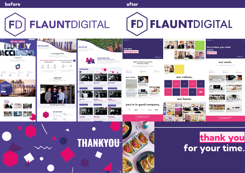
Our brand re-fresh is now a whole year old! This upgrade to our visual identity came about after some serious growth within the company. We went from 8 – 32 employees in the space of 8 years, moved to a fabulous new office space and we were gaining and pitching for more well-known clients. We wanted to show off who we were and stand out in a crowded space.
To stay true to our core values and show our growth through modernisation. We wanted to communicate who we were in 2023 as opposed to where we started in 2015 – more grown up, confident and bold. With very subtle updates to:
Last month Meta announced a Facebook brand re-fresh. With a re-drawn logo with the “f”
sitting on an electric blue for. They created an elevated colour palette consisting of a range of blue hues, with a focus on accessibility.
“The goal of our work was to expand upon our foundation and create the defining mark of our brand that anchors the identity system across Facebook. We wanted to ensure that the refreshed logo felt familiar, yet dynamic, polished and elegant in execution. These subtle, but significant changes allowed us to achieve optical balance with a sense of forward movement.” – Dave N, Director of Design, Facebook
Quote and images courtesy of Meta/Facebook
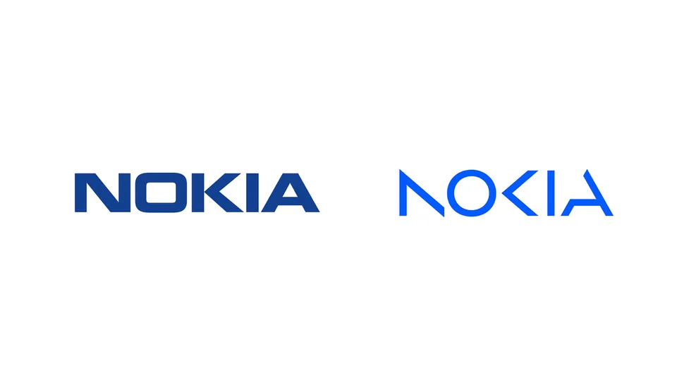
The NOKIA rebrand is a pretty momentous shift, coming to fruition because of a major change to strategy and capturing who they are as a business in the current day “with renewed energy and commitment as pioneers of digital transformation” as they move into the B2B tech space. The bold and modern transformation sees shapes within the logo being used throughout brand photography showing the people they work alongside and connect.
Logo: Old (left) vs new (right)
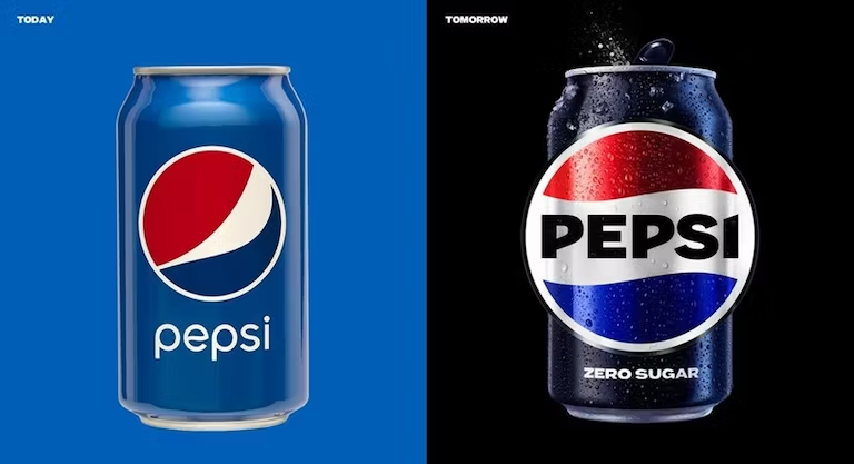
My favourite… now that’s a whole other blog PEPSI vs Coca-Cola anyway back to it. PEPSI have given us a super fun rebrand as they celebrate 124 years it’s the first logo update in 14 years. A re-designed logo that nods to a previous logo they used throughout the 70s 80s and 90s celebrating it’s but with a leap toward the future.
Now you know the difference and have been inspired by some of our faves, what do you think of your current brand identity? Could it be time for something new, re-brand or refresh? Get in touch with our creative experts and we’ll let you know what we think!


