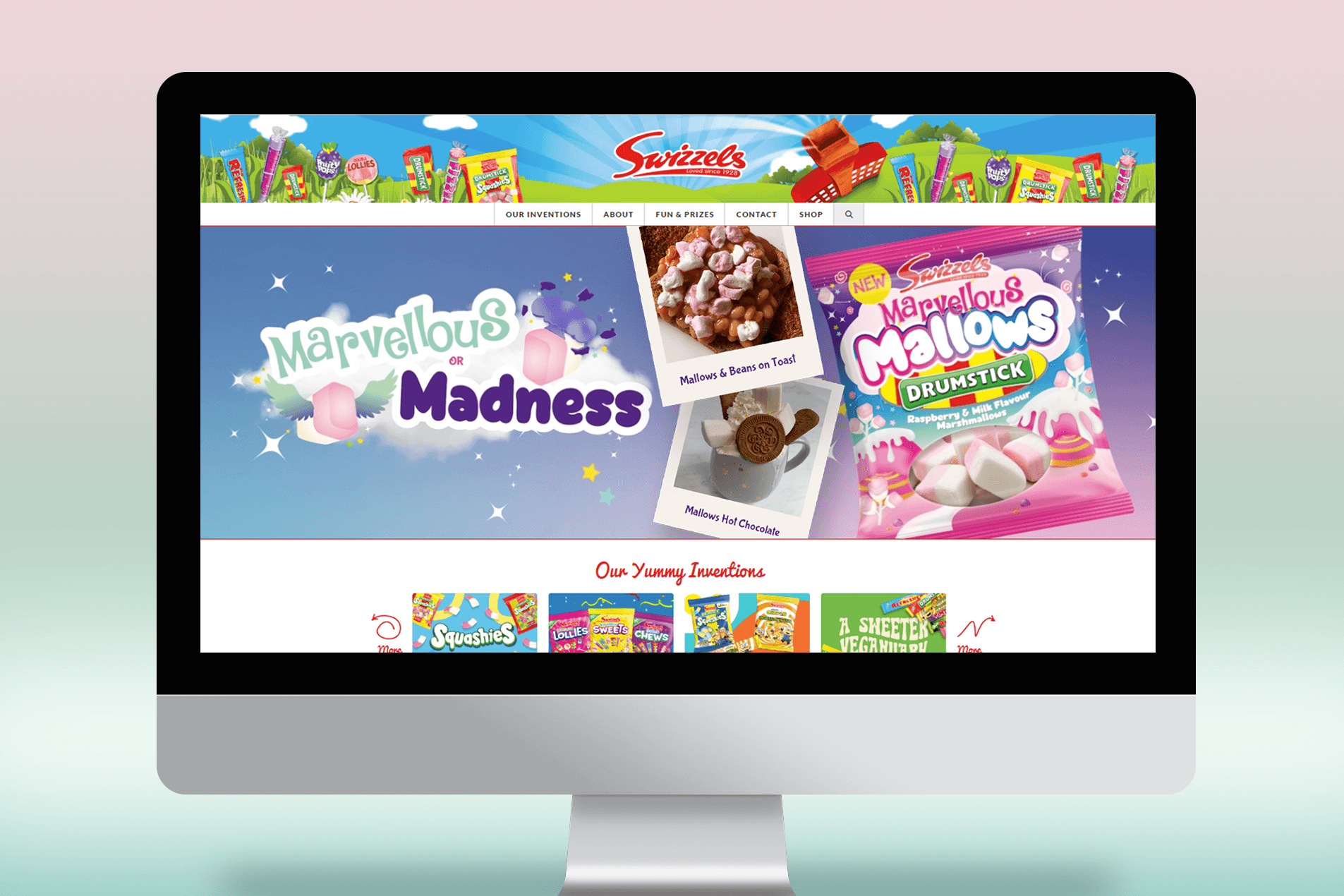
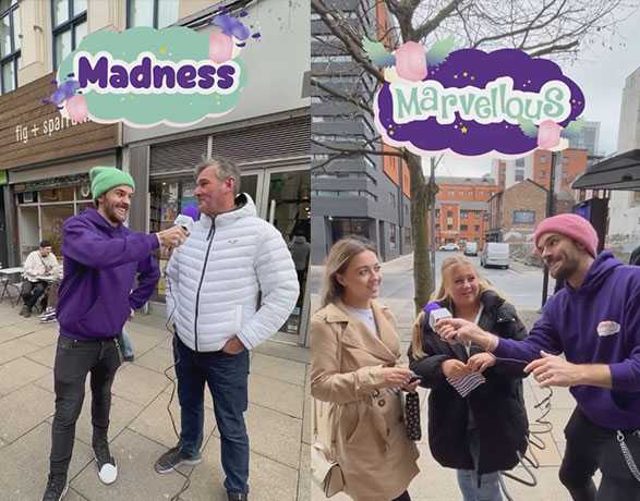
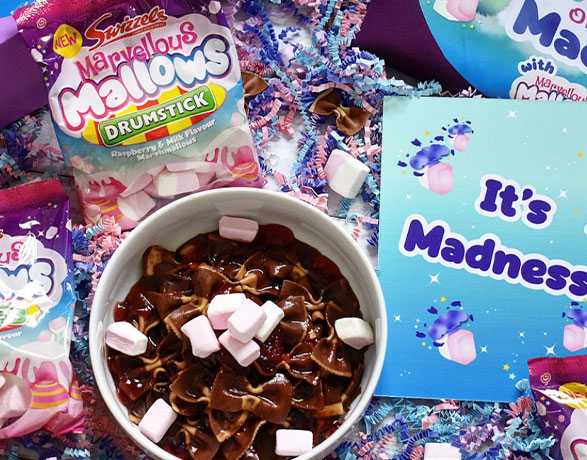
We began our journey with a creative brainstorming session, immersing ourselves in the brand and product. Ideas flowed, and we carefully selected and refined concepts that best aligned with the campaign brief. These top-line ideas and creative concepts were then presented to the Swizzels team, with whom we collaboratively decided on the “Marvellous or Madness” campaign theme.
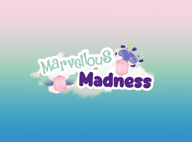
Firstly, we focused on creating a distinct identity for the campaign. Leveraging the existing product identity as a starting point, we incorporated the angel from the packaging to symbolise the “Marvellous” element. To represent “Madness,” we introduced a complementary “mind blow” icon. Drawing inspiration from the vibrant pink, blue, and purple gradient of the Marvellous Mallows packaging, we crafted a bold and impactful colour palette, which stayed true to the brand’s identity while making a statement on social media. Purposefully matched fonts were employed, with a cursive and celebratory style for “Marvellous” and a bold and daring style for “Madness.”
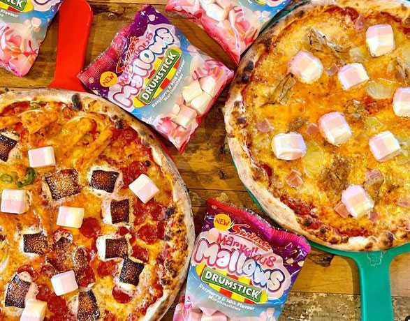
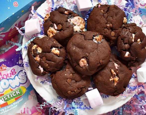
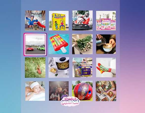
Once the identity was established, we delved into the strategy and mechanics of the competition. Collaborating closely with the Swizzels team, we brainstormed content ideas that would span the eight-week campaign period. Supporting concepts, scamps for grid content, and additional PR ideas were presented to further enhance the campaign’s effectiveness.
To ensure a smooth transition for the client, we conducted a comprehensive handover, providing all artwork and assets, including working design files. This empowered the client to apply campaign assets to reactive social media content or any additional materials they wished to create during the campaign period.
