the design process
We conducted competitor research and analysis. Combining this with the brief provided and their current branding, three initial concepts were created: Grids, Oakland’s, “O,” and Bold type.
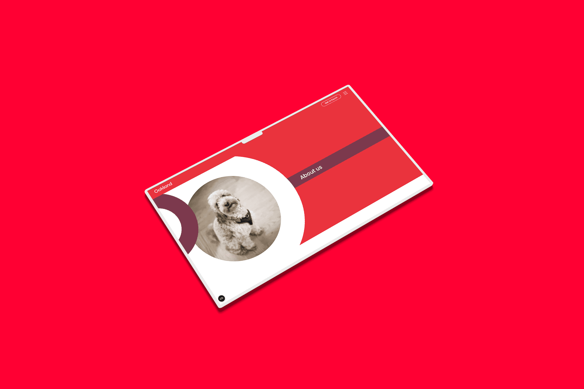
We merged the grids and Oakland’s, “O,” design element, to give both aspects a juxtaposition, showcasing the bold and brave side of Oakland’s brand. Areas of the existing Oakland brand were put to use, but elevated to make them work more dynamically and improve the digital experience on the site.
The concept really suited the used of directional animations, with moving elements such as imagery, typography, and block colour to convey the message of having, “freedom to grow,” in a strategic and mulitfaceted way, positioning Oakland as the anchor bringing everything and everyone together.
During this process, we worked closely with Simon (Bread & Butter), who was working on their branding alongside the website project, with involvement in the feedback process.
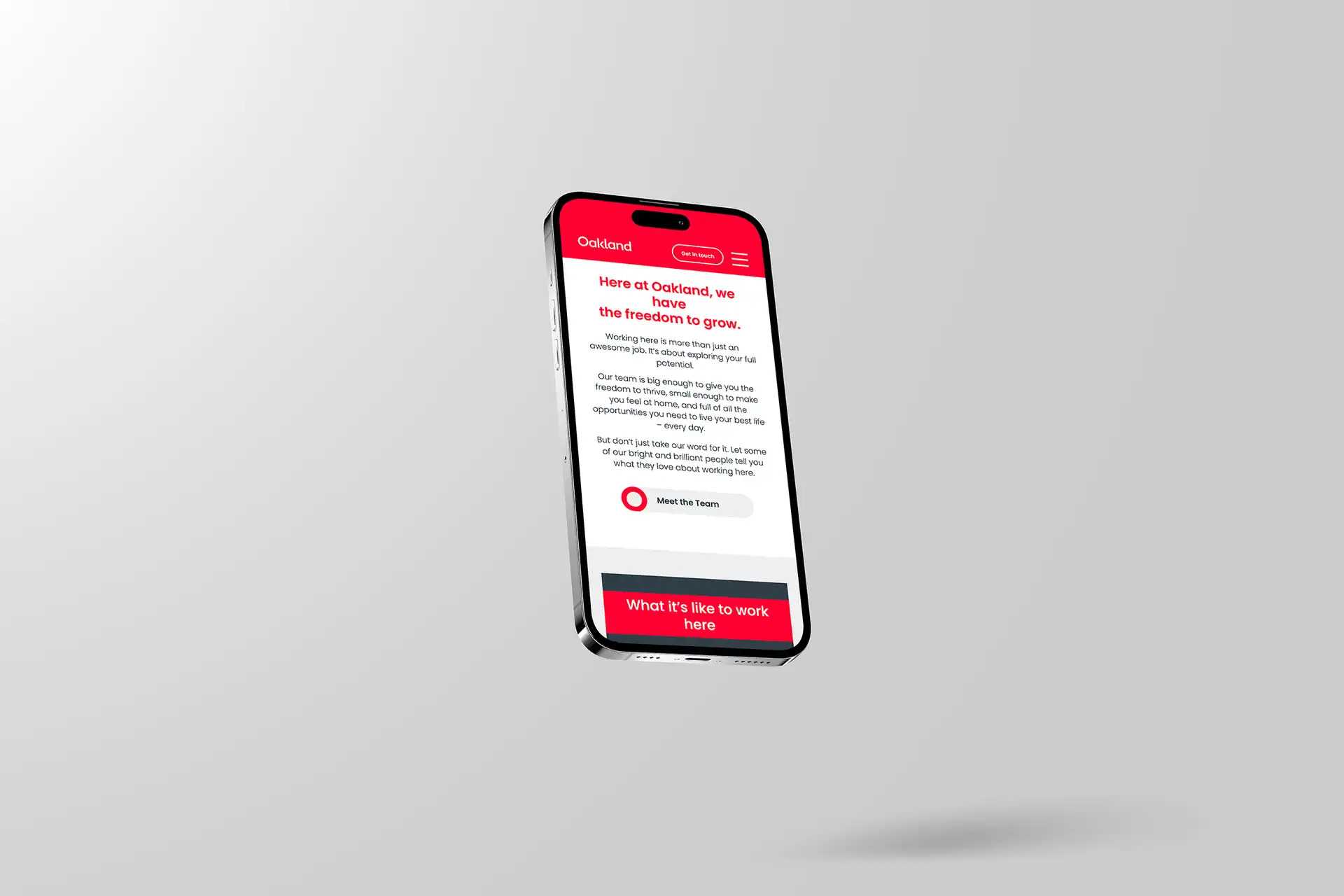
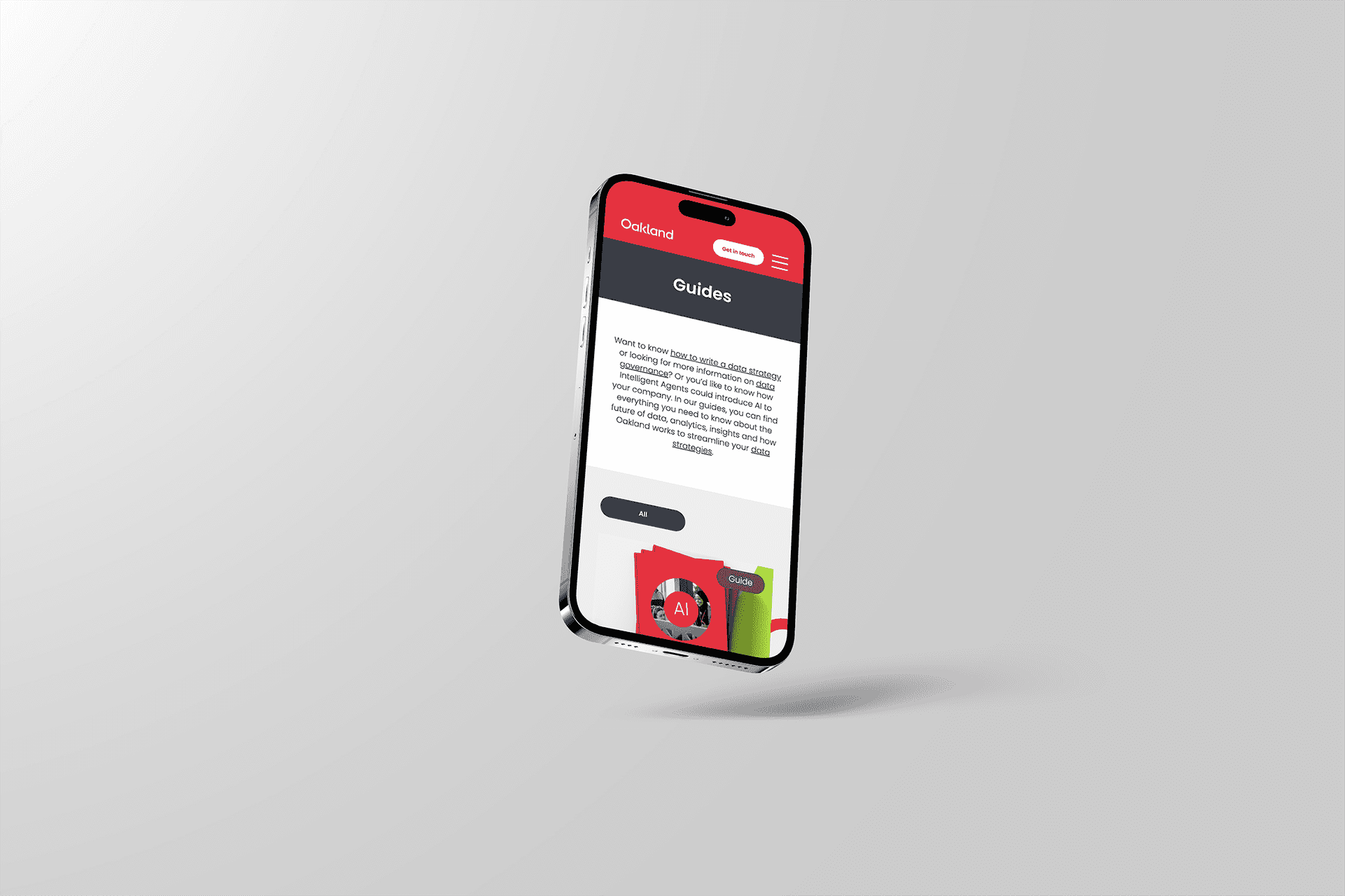
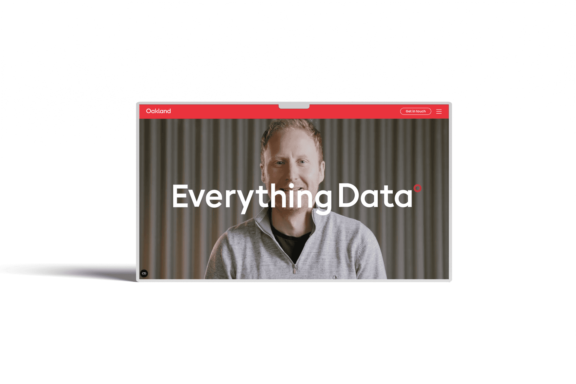
Both mobile and desktop versions of the website were considered at equal measures and shared with the Oakland team using an XD link, which allows for a succinct feedback and amends process.
