11 UX Tips From Google’s Leaked E-commerce Playbook
Written by Daniel
Did you miss the news? Earlier this month, several ‘UX Playbooks’ that Google’s internal search teams reportedly use to manage their 7,000+ websites were leaked.
With Google famously being extremely quiet about sharing tips on how to rank well in its SERPs, you’re probably as surprised as we are that these documents have come to light. Especially as the PDF files are actually hosted on ‘services.google.com’.
We’re certainly not complaining though! These playbooks are guaranteed to offer webmasters an edge over competitors, with countless data-driven tips and recommendations on how to improve on-site user experience and increase conversions.
In total, six playbooks were leaked; detailing the best practices for finance, lead gen, retail, real estate, travel & news websites. Although be warned – they’re pretty lengthy documents.
In this blog, we’ll be discussing the 11 most effective tips from Google’s leaked ‘UX Playbook for Retail’.
All recommendations should be A/B tested
One of the first slides in every single one of these UX playbooks states that “All recommendations should be A/B tested!”. This is a really good point. Whilst the following tips may work for the majority of Google’s transactional sites, every website is different. Using free A/B testing tools such as Google Optimize, or even premium tools such as VWO can be a great way to analyse the impact of any technical amends on your site.
Display a clear CTA above the fold
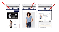
Google describes this as something that’s easy to implement, with a high impact on things like bounce rate and conversions. The examples include brands such as Nike, ASOS and Amazon, as below. The document also encourages websites to use descriptive CTAs to encourage clickthrough rates. For example, instead of telling users to ‘Shop’, your CTA could read ‘Buy Now’ or even better, ‘Shop Our Summer Range’.
Remove automatic carousels
Another one of Google’s top recommendations for retail websites is to opt for user-initiated carousels, rather than automated carousels. It’s a mistake that we see lots of e-commerce sites falling victim to, and something that has been a fairly popular trend in recent years.
So why should you avoid using automated carousels? Research suggests that just under 90% of users click on the first carousel; this means that, whilst some users may still click through to your other hero banners, the majority will not. Therefore your ‘10% Off’ promotion that appears on the second slide is being missed by a huge number of users; maybe you’d be better off having it displayed somewhere else on your site. Google also highlights the following reasons to not use automatic carousels on your e-commerce website:
- Human eyes react to movement (and will miss the important stuff)
- Too many messages equal no message
- Banner blindness
Show top categories on homepage
You may have noticed that a lot of popular fashion sites have been doing this in recent years, especially around the festive season. Sites like ASOS highlight popular categories depending on seasonality; for example, during summer they’ll display Swimwear, T-shirts and Dresses. Whereas in the winter, they’ll display Jackets, Sweatshirts and Hats. If you’re running a sale or promotion, it could also be a good idea to display this as a category on your homepage.
If you have a physical store, include store locator icon in header or menu
This can be a great little trick to help drive footfall to your customers’ local store, and something that’s fairly simple to implement. If you have a large number of stores, it could also help to include search functionality that allows customers to find their nearest store. Additionally, it’s important to avoid using an icon that people may not associate with finding a store; using a Maps Pin, such as the one below, usually works pretty well.
Feature a prominent search bar
This one may be a little trickier to implement depending on the technical skills of your development team, but the impact on conversions can be huge; research suggests that users that search for a product on your site are 200% more likely to convert. Implementing a search bar at the top of your homepage makes it a lot easier for customers to find the specific product they’re looking for. Without this feature, customers may spend time scrolling through various product categories before giving up and clicking off your site. Some of the more impatient users may even click off your site as soon as they realise that they can’t search for a product.
Some ways to boost conversions even more with this feature is to include auto-suggestions and spelling corrections. This won’t take much effort to implement if you’ve already spent time adding a search feature to your site, and it can have a huge impact on conversions. It’s also important to always return search results; if the searched-for product isn’t available then the best alternative is to display some of the most popular products that are in-stock.
Include a value prop at every step of the funnel
If your site offers free shipping on orders over a certain price, or any other USPs that may influence your users to make a purchase, then make sure they know about it! Whether a user is on your homepage, product page, or even ready to check out, you should include a prominent value prop. This is something that can be done fairly easily by adding some code into your header site-wide.
Have price info above the fold
Similarly to displaying a CTA above the fold, showing price info above the fold on all product pages can be a very effective way to encourage users to take action. From a UX perspective, there’s nothing worse than having to mindlessly scroll through a web page to find out how much a product costs. This recommendation is even more effective if the product in question is part of a sale or promotion.
Add urgency elements
Adding elements of urgency to your product and category pages can be a great way to encourage users to make a purchase. This is FOMO (fear of missing out) in its simplest form.
According to Google, there are three ways to create urgency:
- Quantity limitations (e.g. “Only 3 tickets left at this price”)
- Time limitations (e.g. “Discounted tickets until July 1st“)
- Contextual limitations (e.g. “Father’s Day is coming, get a gift now”)
Don’t redirect after adding to cart
Ever clicked ‘Add To Cart’ and had your browser redirect to the checkout, before having to click back to the homepage and start the search for your next product all over again? It’s far from ideal and can encourage users to abandon their cart. Google’s UX Playbook for Retail advises webmasters to implement a drop-down menu that displays a users’ existing cart, along with options to ‘Checkout’ or ‘Continue Shopping’. This, combined with upselling other products through a ‘Customers Also Bought’ CTA that displays related products, can be a really effective way to bump up AOV.
Allow guest checkout
Finally, allowing customers without an account to checkout as a guest is a really effective way to reduce abandoned carts. As a user it can be very frustrating to spend time going through the whole order process, only to discover that you need to create an account with the retailer to complete your order. Allowing users to checkout as a guest, or even by connecting their social media accounts, really is best practice for any e-commerce website. Saying that, a great way to encourage users to create an account is by including a value prop; such as offering users 10% off their next purchase if they create an account.
So there you have it, our top 11 recommendations from Google’s UX Playbook for Retail. These tips can be a great way to boost sales and increase the overall user experience of your e-commerce website, but it’s only the start. We’d advise taking some time to go through the full UX Playbook for Retail to find out some other tips and recommendations from Google’s organic search experts.
Did you notice any other tips that should have made this list? Why not let us know in the comments or on Instagram or Twitter?
Want to discover more digital marketing tips and tricks? Why not sign up to our mailing list for all the latest insights from Flaunt Digital?


